")
Bold color choices and traditional design details are replacing years of minimalist neutral window treatments. Smart color selection transforms room ambiance while trending hues create stunning focal points.
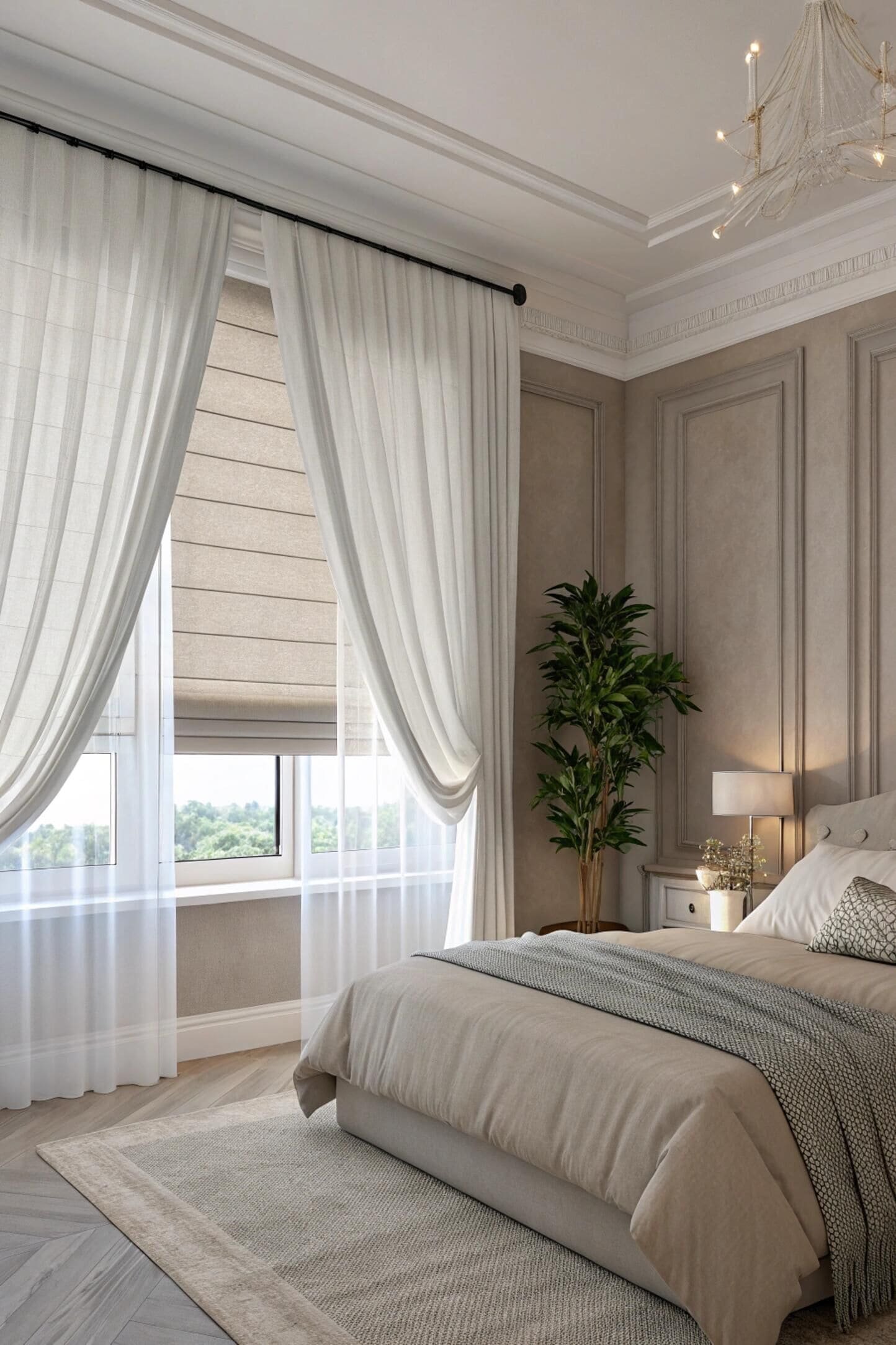
Natural neutrals dominate 2024 with warm earth tones and sophisticated creams leading popularity. Bold colors and traditional pleated details replace minimalist designs, while cool blues and warm yellows create specific mood effects in living spaces.
I discovered the power of color psychology[^1] during a recent project where changing from stark white blinds to warm beige transformed the entire room's atmosphere. The client went from feeling cold and unwelcoming to cozy and inviting simply through thoughtful color selection.
What is popular in blinds right now?
Natural yet sophisticated colors dominate current trends with luxe soft neutrals and warm earth tones[^2] leading the way. Bold colors and traditional details are making a strong comeback after years of minimalist design.
Soft neutrals like cream and beige lead current trends alongside warm earth tones. Traditional details including pleats and decorative trims[^3] replace minimalist designs, while smart technology integration becomes increasingly popular across all color options.
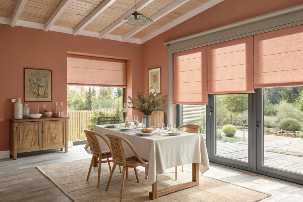
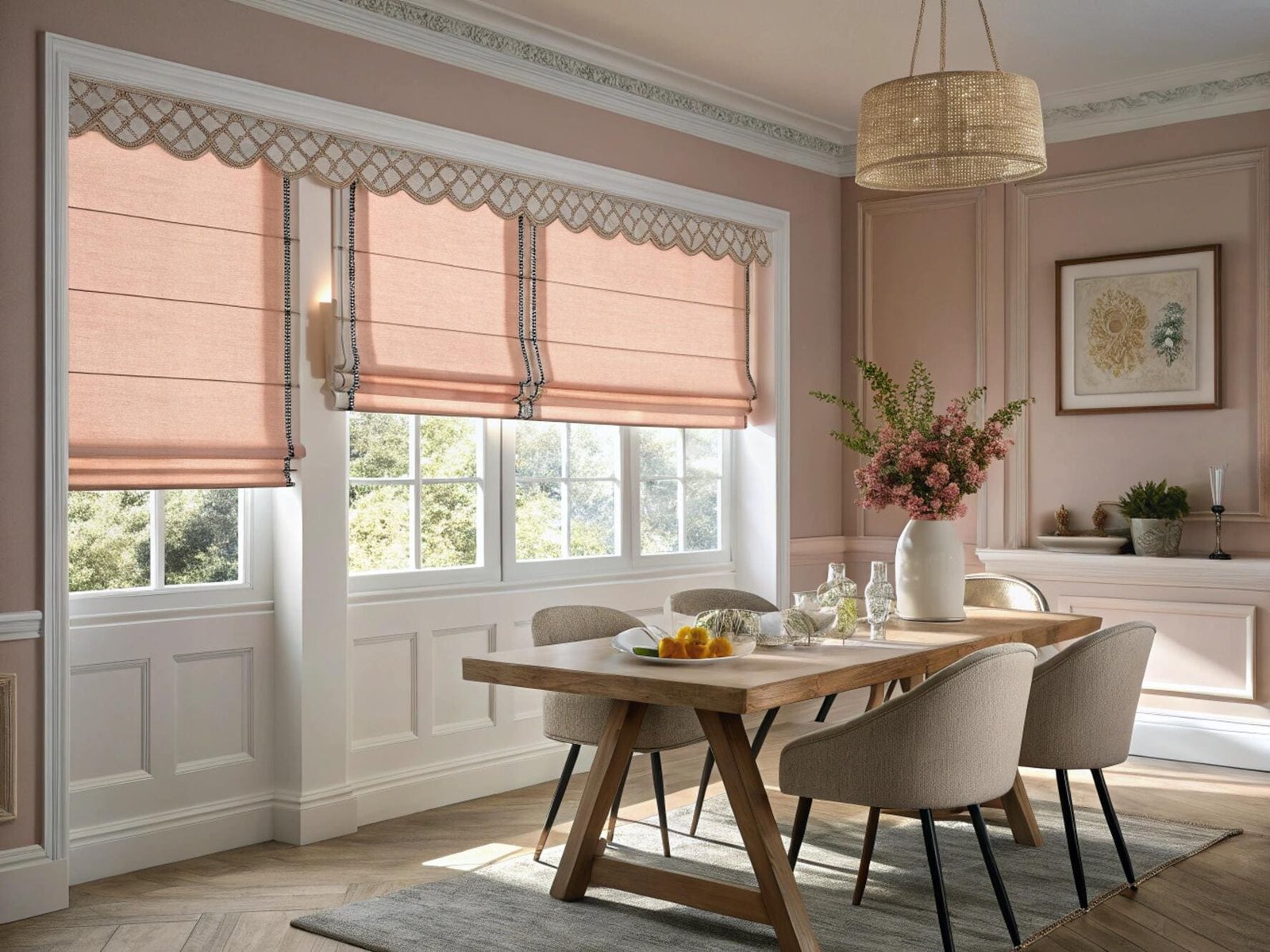
Current blind trends emphasize natural sophistication through carefully selected color palettes that create warm, welcoming environments. The Pantone Color of the Year for 2024, Peach Fuzz, represents this shift toward "velvety gentle" tones that radiate warmth and modern elegance.
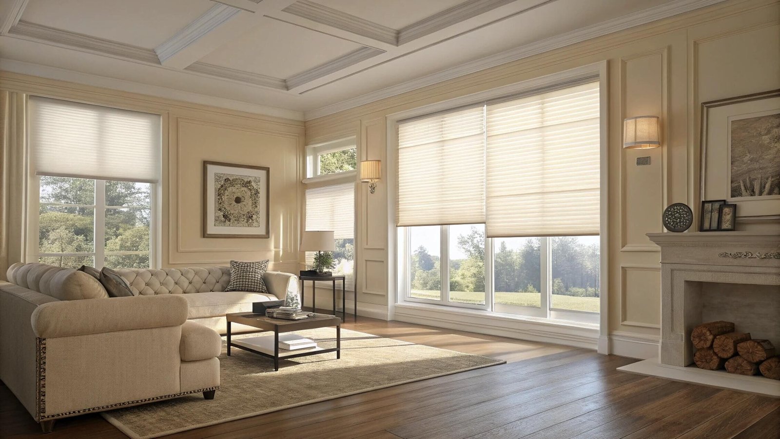
Neutral colors remain popular because they provide versatility and timeless appeal that works across various design styles. Cream, beige, and soft gray blinds create sophisticated backdrops that complement rather than compete with existing decor elements.
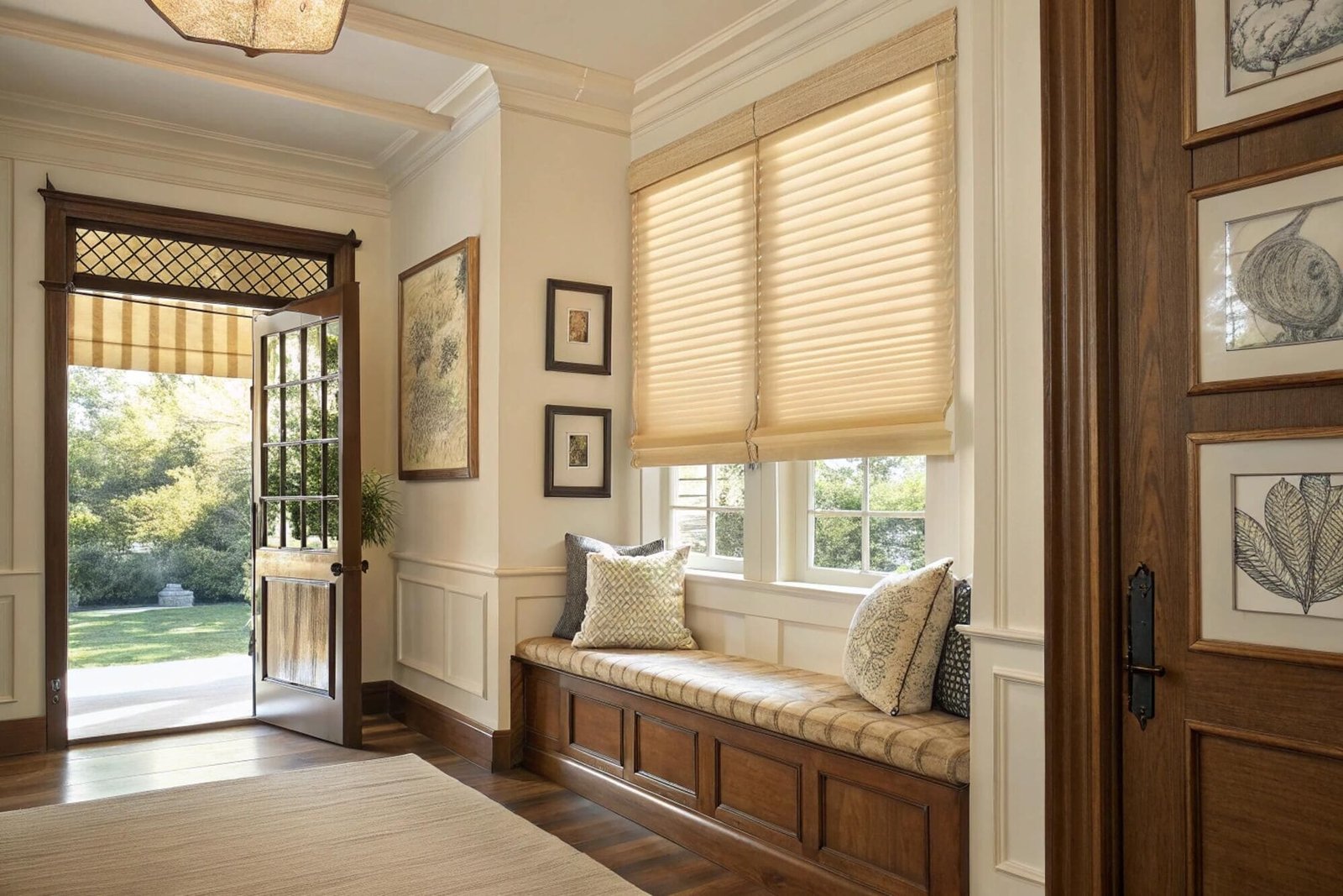
Traditional details are experiencing a renaissance with pleats, beautiful trims, and decorative hardware replacing the stark minimalism of recent years. These classic elements add visual interest and craftsmanship that elevates window treatments from functional necessities to integral design features.
Bold colors are gaining acceptance as homeowners embrace personality and character in their spaces. Rich blues, warm yellows, and earth-toned greens provide statement-making options that create focal points and express individual style preferences.
Smart technology integration continues expanding across all color options, with motorized controls becoming standard rather than premium features. This technological advancement allows homeowners to enjoy beautiful colors while benefiting from convenient automation and energy efficiency.
Textural materials are trending alongside color choices, with natural rattan, coarse pottery textures, and vintage-inspired fabrics adding depth and tactile interest to window treatments.
Popular Color Categories
Natural Neutrals:
- Cream and beige: Versatile sophistication for any design style
- Soft grays: Modern elegance with timeless appeal
- Warm whites: Fresh brightness without stark coldness
- Earth tones: Grounding stability connecting indoor and outdoor spaces
Trending Accents:
- Peach Fuzz: Pantone 2024 color bringing warmth and modern elegance
- Soft blues: Calming sophistication ideal for bedrooms and offices
- Warm yellows: Cheerful energy perfect for kitchens and living areas
- Deep greens: Natural tranquility creating peaceful environments
Design Elements:
- Pleated styles: Traditional craftsmanship returning to prominence
- Decorative trims: Personality and visual interest[^4] enhancement
- Textural fabrics: Depth and tactile appeal beyond flat surfaces
- Metallic accents: Hardware featuring gold, aluminum, and painted finishes
How do you choose the color of your blinds?
Blind color selection depends on matching window trim, coordinating with wall colors, considering room function[^5], and balancing personal style with practical needs for optimal results.
Match blinds to window trim for architectural integration, coordinate with wall colors for cohesive design, or choose contrasting colors for focal points. Consider room function, natural light, and personal style preferences for optimal color selection.
Choosing blind colors requires systematic consideration of multiple factors that affect both aesthetic appeal and functional performance. The most successful selections balance visual harmony with practical requirements for each specific space.
Window trim matching provides the safest color selection approach, creating seamless architectural integration that makes blinds appear as natural extensions of existing features. This strategy works particularly well when window treatments should complement rather than compete with other room elements.
Wall color coordination offers opportunities for both harmonious blending and strategic contrast. Matching wall colors creates unified, spacious feelings while contrasting choices establish focal points and add visual interest to otherwise neutral spaces.
Room function significantly influences optimal color choices through lighting requirements, usage patterns, and desired atmospheres. Kitchens benefit from easy-to-clean, bright colors while bedrooms require calming, restful tones that promote relaxation.
Natural light conditions affect how colors appear throughout the day, making sample evaluation essential under various lighting scenarios. Colors can appear dramatically different under morning sunlight versus evening artificial light, requiring careful consideration of primary usage times.
Personal style preferences should guide final decisions while considering long-term satisfaction and flexibility for future decor changes. Trendy colors may become dated quickly while classic choices provide enduring appeal and adaptability.
Color Selection Framework
Assessment Factors:
- Room function: Light control, privacy, and atmosphere requirements
- Existing decor: Wall colors, furniture, and architectural elements
- Natural light: Window orientation and daily light patterns
- Personal style: Color preferences and design aesthetic goals
Matching Strategies:
- Trim matching: Seamless architectural integration
- Wall coordination: Harmonious color flow or strategic contrast
- Furniture accent: Complementing key furniture pieces
- Flooring connection: Coordinating with wood or carpet tones
Practical Considerations:
- Maintenance requirements: Cleaning frequency and difficulty
- Durability expectations: Fade resistance and long-term appearance
- Room size effects: Color impact on perceived space
- Seasonal considerations: Year-round color satisfaction
What is the most popular color for blinds?
White and off-white blinds maintain highest popularity due to versatility, light reflection, and timeless appeal. Natural neutrals including beige and cream follow closely for sophisticated warmth.
White blinds dominate popularity through versatility and light enhancement, while off-white and cream options provide sophisticated warmth. Natural neutrals like beige and soft gray offer timeless elegance suitable for various design styles.
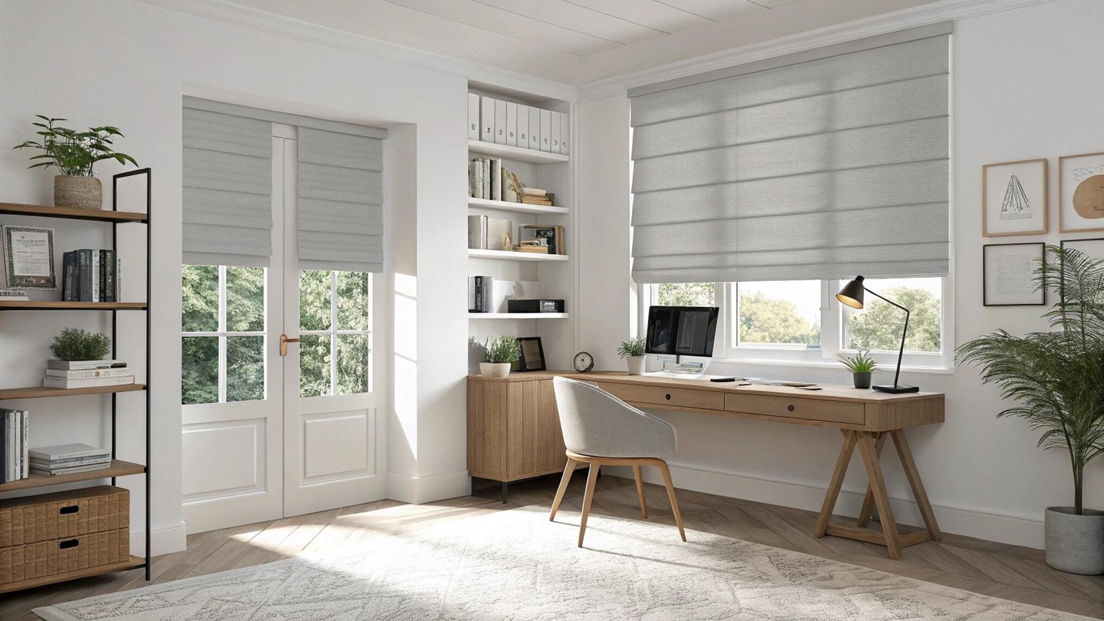
White blinds consistently rank as the most popular choice across residential and commercial applications due to their unmatched versatility and ability to enhance natural light. Their neutral nature allows seamless integration with any color scheme or design style.
Off-white variations provide subtle warmth while maintaining the light-enhancing benefits of pure white. These softer tones create more inviting atmospheres without sacrificing the fresh, clean appearance that makes white blinds so appealing.
Natural neutrals including beige, cream, and soft gray have gained significant popularity as homeowners seek sophisticated alternatives to stark white. These colors provide warmth and character while maintaining the versatility that makes neutral blinds practical long-term investments.
The popularity of neutral colors stems from their ability to complement rather than compete with existing decor elements. They serve as perfect backdrops for artwork, furniture, and accessories while providing flexibility for future room updates.
Light reflection capabilities make white and light-colored blinds particularly valuable in smaller spaces or rooms with limited natural light. Their ability to bounce light around rooms creates brighter, more spacious feelings that enhance overall comfort.
Market research consistently shows that neutral blinds maintain higher resale values and broader appeal, making them sound investments for homeowners considering future property sales or rental applications.
Popularity Rankings
Top Neutral Choices:
- Pure white: Maximum versatility and light enhancement
- Off-white: Subtle warmth with clean appearance
- Cream: Sophisticated warmth and timeless elegance
- Beige: Natural earthiness with broad appeal
Trending Alternatives:
- Soft gray: Modern sophistication with neutral flexibility
- Light taupe: Warm neutrality with design depth
- Warm white: Cozy brightness without stark coldness
- Natural wood tones: Organic warmth and textural interest
Regional Variations:
- Coastal areas: Cooler whites and soft blues
- Urban settings: Sophisticated grays and modern neutrals
- Traditional homes: Warm creams and classic beiges
- Contemporary spaces: Pure whites and cool grays
Should blinds be lighter or darker than walls?
Blind color relationships with walls depend on desired effects, with lighter blinds creating spacious feelings and darker blinds adding depth and contrast for visual interest.
Lighter blinds typically work best with most wall colors, creating spacious, airy feelings and seamless integration. Darker blinds provide dramatic contrast and sophisticated depth but should be used strategically to avoid overwhelming spaces.

The relationship between blind colors and wall colors significantly affects room perception and overall design success. Understanding these relationships helps create desired atmospheres while avoiding common coordination mistakes.
Lighter blinds generally create more spacious, airy feelings by reflecting light and blending seamlessly with wall colors. This approach works particularly well in smaller rooms or spaces with limited natural light where brightness enhancement is priority.
Darker blinds provide dramatic contrast and sophisticated depth when used strategically against lighter walls. This approach creates focal points and adds visual interest but requires careful balance to prevent overwhelming the space.
Tone-on-tone coordination using similar color families in different shades creates sophisticated, cohesive looks that feel intentional and professionally designed. This approach works well for both light and dark color preferences.
Contrasting approaches can create striking visual effects when executed properly, but require careful consideration of room size, natural light, and overall design goals to avoid jarring or unbalanced appearances.
Room function should influence color relationships, with relaxing spaces benefiting from harmonious coordination and active spaces potentially handling more dramatic contrasts effectively.
Color Relationship Guidelines
Lighter Blind Benefits:
- Spacious feelings: Visual expansion through light reflection
- Seamless integration: Harmonious blending with wall colors
- Brightness enhancement: Improved natural light distribution
- Versatile coordination: Easy matching with various decor elements
Darker Blind Applications:
- Dramatic contrast: Sophisticated depth and visual interest
- Focal point creation: Drawing attention to window areas
- Luxury aesthetics: Rich, elegant appearance enhancement
- Statement making: Bold design choices expressing personality
Coordination Strategies:
- Complementary contrast: Different but harmonious color families
- Tone-on-tone: Same color family in different intensities
- Neutral bridge: Using neutral blinds with colored walls
- Accent coordination: Matching blind colors to room accent colors
What color blinds make a room look bigger?
Light colors including white, cream, and pale pastels make rooms appear larger by reflecting light and creating seamless visual flow. Cool tones enhance spaciousness more effectively than warm colors.
Light colors like white, cream, and pale pastels create larger-feeling rooms through light reflection and visual continuity. Cool tones including soft blues and greens enhance spaciousness while warm colors can make spaces feel more intimate.
Light-colored blinds create the illusion of larger spaces through multiple psychological and physical effects that enhance perceived room dimensions. Understanding these principles helps select colors that maximize spatial feelings.
White blinds provide maximum space enhancement by reflecting the most light and creating seamless integration with light-colored walls. Their neutral nature eliminates visual boundaries that can make rooms feel constrained or choppy.
Cream and beige blinds offer space-enhancing benefits while providing subtle warmth that makes rooms feel inviting rather than clinical. These colors work particularly well in rooms where pure white might feel too stark.
Pale pastels including soft blues, greens, and lavenders create spacious feelings while adding gentle color interest. These colors have "receding" qualities that make surfaces appear farther away, enhancing depth perception.
Cool-toned colors generally enhance spaciousness more effectively than warm colors because they create psychological distance and freshness. Blues and greens naturally make rooms feel more open and airy.
Avoiding dark colors is crucial for smaller spaces, as they absorb light and create visual weight that can make rooms feel confined. However, strategic use of darker colors can add depth when balanced with lighter elements.
Space-Enhancing Color Strategies
Maximum Space Enhancement:
- Pure white: Ultimate light reflection and visual expansion
- Off-white: Subtle warmth with spacious feelings
- Pale cream: Gentle sophistication with openness
- Light gray: Modern neutrality with space enhancement
Cool Color Benefits:
- Soft blue: Receding quality creating depth perception
- Pale green: Natural freshness with spacious feelings
- Light lavender: Gentle color with expansive effects
- Cool white: Crisp brightness maximizing space perception
Design Principles:
- Light reflection: Maximizing natural light distribution
- Visual continuity: Seamless color flow eliminating boundaries
- Minimal contrast: Avoiding jarring color changes
- Horizontal emphasis: Colors that draw eyes across rather than down
Should blinds be the same color in every room?
Blind colors don't need to match throughout homes, with thoughtful variation creating character and addressing specific room needs while maintaining overall design cohesion through coordinated color families.
Blinds don't need to match throughout homes and often shouldn't. Thoughtful variation addresses specific room needs while maintaining cohesion through coordinated color families or consistent styles that create professional, intentional appearances.
Matching blinds throughout homes creates uniformity but may not address individual room requirements or maximize each space's potential. Professional designers often recommend thoughtful variation that creates character while maintaining overall cohesion.
Room-specific requirements should guide color choices, with kitchens benefiting from easy-to-clean, bright colors while bedrooms require calming, restful tones. Forcing identical colors throughout ignores these functional differences.
Coordinated color families provide unity without monotony, using different shades of the same color family or complementary colors that create intentional, professional appearances. This approach allows customization while maintaining design coherence.
Open concept spaces may benefit from consistent blind colors to create visual flow, while separated rooms can handle more variation without disrupting design unity. The key is understanding sight lines and visual connections.
Architectural consistency through matching trim or hardware colors can unify different blind colors throughout homes, creating cohesive looks that feel intentional rather than haphazard.
Personal preferences and lifestyle factors should influence decisions, with some homeowners preferring consistent simplicity while others enjoy varied, expressive color choices that reflect different room personalities.
Coordination Strategies
Consistent Approach Benefits:
- Visual unity: Seamless flow throughout home
- Simplified maintenance: Uniform cleaning and replacement
- Timeless appeal: Classic coordination that doesn't date
- Resale value: Broad appeal for future buyers
Varied Approach Advantages:
- Room-specific optimization: Colors suited to individual needs
- Personal expression: Reflecting different room personalities
- Design interest: Avoiding monotonous repetition
- Functional benefits: Addressing specific lighting and privacy needs
Coordination Methods:
- Color family consistency: Different shades of same color group
- Style uniformity: Same blind type in different colors
- Hardware matching: Consistent mechanisms with varied colors
- Trim coordination: Blinds matching architectural elements
How do blind colors affect room mood and energy?
Blind colors significantly influence room mood through psychological associations and light interaction, with warm colors creating energy and cool colors promoting relaxation and focus.
Warm blind colors like yellows and oranges create energetic, welcoming atmospheres while cool colors like blues and greens promote calmness and focus. Neutral colors provide balanced moods suitable for versatile room functions.
Color psychology research demonstrates how different hues trigger specific emotional and physiological responses that affect room atmosphere and occupant well-being. Understanding these effects enables strategic blind color selection that supports desired room functions and moods.
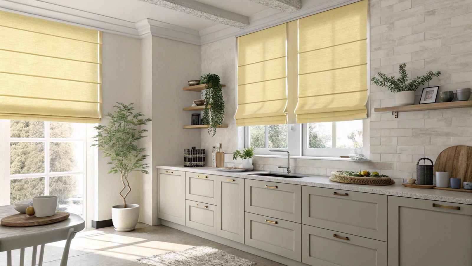
Warm colors including reds, oranges, and yellows create stimulating, energetic environments that promote activity and social interaction. These colors work particularly well in kitchens, dining rooms, and living areas where energy and conversation are desired.
Cool colors including blues, greens, and purples promote calmness, relaxation, and focus that make them ideal for bedrooms, offices, and meditation spaces. These colors have been shown to lower heart rate and blood pressure while improving concentration.
Neutral colors including whites, grays, and beiges provide balanced, versatile moods that work across various activities and time periods. Their psychological neutrality makes them excellent choices for multi-purpose rooms or spaces requiring flexibility.
Natural light interaction with blind colors affects mood throughout the day, with morning sunlight enhancing warm colors while afternoon light can intensify cool tones. Understanding these patterns helps predict how color choices will feel during primary room usage times.
Seasonal considerations influence how colors affect mood, with warm colors providing comfort during winter months while cool colors offer relief during summer heat. Strategic color selection can counterbalance seasonal mood challenges.
Cultural associations with specific colors may influence individual responses, making personal preferences important factors alongside general psychological principles. What feels energizing to one person may feel overwhelming to another.
Individual sensitivity to color varies significantly, with some people experiencing strong mood responses while others remain relatively unaffected. Testing color samples in actual lighting conditions helps predict personal responses to different options.
Color Psychology Effects
Energizing Colors:
- Yellow: Stimulates mental activity and promotes optimism
- Orange: Encourages enthusiasm and social interaction
- Warm red: Creates excitement and passionate energy
- Coral: Provides friendly warmth without overwhelming intensity
Calming Colors:
- Blue: Promotes tranquility and mental clarity
- Green: Provides natural balance and stress reduction
- Lavender: Encourages relaxation and peaceful feelings
- Soft gray: Creates sophisticated calmness and focus
Mood-Neutral Options:
- White: Provides clean, fresh feelings without strong emotional impact
- Beige: Offers gentle warmth with versatile mood support
- Taupe: Creates sophisticated comfort suitable for various activities
- Cream: Provides soft elegance without overwhelming personality
Functional Applications:
- Bedrooms: Cool blues and soft greens for restful sleep
- Home offices: Balanced grays and soft blues for concentration
- Kitchens: Warm yellows and creams for welcoming energy
- Living rooms: Flexible neutrals supporting varied activities
Seasonal Mood Support:
- Winter comfort: Warm creams and soft yellows combating seasonal depression
- Summer cooling: Cool blues and greens providing psychological relief
- Spring renewal: Fresh greens and soft pastels supporting positive energy
- Fall grounding: Warm earth tones providing stability and comfort
Personal Considerations:
- Individual color sensitivity: Testing responses to different hues
- Lifestyle patterns: Aligning colors with daily routines and activities
- Cultural backgrounds: Considering personal associations with specific colors
- Long-term satisfaction: Choosing colors that remain appealing over time
Conclusion
Strategic blind color selection balances trending aesthetics with psychological effects, functional requirements, and personal preferences to create beautiful, mood-supporting environments that enhance daily living.
Transform Your Space with Expert Color Consultation
Stop guessing about blind colors that could transform your rooms into perfect environments. Professional color consultation eliminates costly mistakes while creating mood-enhancing spaces that support your lifestyle and aesthetic goals.
Expert blind color analysis identifies optimal choices that enhance natural light, support desired moods, and create cohesive design throughout your spaces.
Immediate color benefits:
- Mood optimization through scientifically-proven color psychology principles
- Space enhancement making rooms appear larger and brighter
- Design cohesion creating professional, intentional appearances
- Light maximization improving natural illumination and energy efficiency
Professional color services:
- Room-by-room analysis determining optimal colors for specific functions
- Mood assessment identifying colors supporting desired atmospheres
- Coordination planning ensuring cohesive flow throughout living spaces
- Trend integration balancing current styles with timeless appeal
Proven color transformation results:
- Enhanced natural light distribution improving room brightness and energy
- Improved mood support through strategic warm and cool color placement
- Increased perceived space through expert light color selection
- Professional design cohesion creating magazine-worthy interior coordination
Color consultation advantages:
- Scientific approach using proven color psychology principles
- Personalized recommendations addressing individual preferences and needs
- Professional coordination ensuring colors work together effectively
- Long-term satisfaction through timeless choices that won't date quickly
Expert analysis includes:
- Natural light assessment determining how colors appear throughout the day
- Mood requirement evaluation identifying optimal colors for room functions
- Existing decor coordination ensuring blinds complement current furnishings
- Future flexibility planning selecting colors that adapt to potential changes
Professional specifications ensure:
- Color accuracy through proper lighting evaluation and sample testing
- Quality materials providing true color reproduction and fade resistance
- Coordinated hardware complementing chosen colors with appropriate finishes
- Installation precision ensuring colors appear exactly as intended
Design transformation includes:
- Room-specific color strategies optimizing each space for its intended use
- Cohesion planning creating intentional flow throughout living areas
- Trend integration incorporating current styles while maintaining classic appeal
- Personalization reflecting individual taste while following design principles
Transform your rooms with perfect blind colors:
Email: info@velablinds.com | WhatsApp: +86 13720128317
---

[^1]: Discover the impact of color on emotions and how to use it effectively in your home.
[^2]: Understand the appeal of warm earth tones and how they can enhance your living spaces.
[^3]: Learn how decorative trims can enhance the visual appeal of your window treatments.
[^4]: Explore creative ideas to make your window treatments stand out and enhance your decor.
[^5]: Explore how the purpose of a room can guide your color selection for optimal results.
Partner with VelaBlinds for Your Next Project
Smart window treatments shouldn't be complicated. After working with 500+ distributors and contractors worldwide, I've streamlined the process to get you quality products, competitive pricing, and reliable support - every time.
Why project professionals choose VelaBlinds:
- ✅ Fast, Accurate Quotes - Detailed specs and pricing within 24 hours
- ✅ Transparent Pricing - No hidden fees, volume discounts clearly outlined
- ✅ Quality Assurance - Direct partnerships with certified OEM manufacturers
- ✅ Project Support - Dedicated account manager from quote to delivery
Start your next project:
📧 Quick Quote: Send your requirements to info@velablinds.com
📱 Direct Contact: WhatsApp +86 137 2012 8317
🌐 Browse Solutions: https://velablinds.com/
📁 Product Resources: Access spec sheets, catalogs & project files
Jimmy Chen, Founder
"I built VelaBlinds to solve the real challenges I faced as a project buyer - long lead times, unclear specs, and unreliable suppliers. Let's discuss how we can power your projects with smarter blinds."
Serving distributors and contractors across North America, Europe, and Australia since 2018.